Thursday, December 10, 2015

Final Self-Evaluation

This class was an interesting journey. I was able to try a few new mediums and re-familiarize myself with oil painting, so in the end I'm glad I was able to complete my basic goals. Though I don't think my assignments resulted in any masterpieces for my portfolio, I do think I started a few ideas that I would like to explore some more (the Kindle ads for example endeared me to the jellyfish backpack idea and also the "human" side of technology use). More importantly it was a good preview of what advertising illustration might entail; I can't say it's something I'd jump at the chance to do again, though that's mostly because I don't feel illustration has a sensible place in corporate advertising any more. The struggle to find good ideas that couldn't be replicated by photography meant I had to go the cheesy route most of the time (and while I can happily be a cheesy person, feeling exclusively limited to being that way discouraged proper creativity). It might be fun once in a while, but not to this extent!

As for technical growth, it was good to hear others voice my issue with creating contrasting values; I definitely need to correct that in my digital work as well. Besides that I found some rewarding aspects in my color explorations, which didn't feel far from what I would do with a computer. I learned better combinations of liquin, gesso and paint and ran into little trouble finding the colors I wanted. With my struggles creating detail on small surfaces, though I wasn't super successful in being clean and clear on them, I found it more efficient to move on to different concepts quickly without having to get a giant canvas covered in paint (especially important for someone like me who likes to focus on one piece at a time until it becomes boring).

Ultimately while I think I could have worked harder, made better work, and explored ideas closer to my heart, that would have required a different starting point for this semester. An experience like this is also conducive to learning, and I can't say it wasn't worth going through!

Monday, December 7, 2015

Dear Jinae,

It sounds like you are stuck in some weird twilight zone between feeling ambitious and playing it safe. Fear of failure should not modify the standards you set for your work. Aim as high as you can and THEN fail; don't compromise and choose more familiar tasks so you can avoid bigger failures.

I have plenty of my own failures, but it's the colossally weird stuff that often ends up succeeding; ideas that sound unjustifiably stupid in writing can become really amazing paintings. Allow yourself to explore those weird ideas more, because you never know what great things they may become!

Having said that, while I think that your concerns about balancing specialization and versatility are valid, you are too quick to make value judgments of your work based on how familiar your subject matter is to you. It's ok to use what you're good at as an anchor for exploring new territories.

As for your worries about audience, you shouldn't overly concern yourself with what they want. We can't get into every person's head and analyze what they want to see, and they themselves don't usually know the answer until they're staring it in the face. If all you can make is an educated guess, you're likely to stifle your own creativity and end up with something cliched. And neither you nor they want that! If you make something you really love, it will attract people who will love it as well. This discomfort you feel about having to make something you don't believe in, just because you think it may appeal to someone else, isn't helping you stay motivated and it sounds like it's affecting your art for the worse. Emotional distress is common enough among artists without the additional frustration of forcing oneself to make boring work. You say that you'll happily slave all day and night on art so long as it's a personal project. So let your "work" be personal as well! Choose to do projects that you'll love to do, and stop compromising.

Sincerely,
Dana

Monday, November 23, 2015

Clare Woods is a British painter who began her career as a sculptor. She primarily paints abstracted landscapes, but humans also feature in her more recent works.

I am not a fan of these current works, (that brand of abstraction is a bit boring and I feel they lack interesting compositions or cohesion), but her landscapes from a few years ago are stunning amalgamations of shape and color with an inspiring economical abstraction of light and form.

Bleeding Cross, 2008
From the whimsy of some of her works, one would hardly guess that Woods works from photographic imagery. She photographed these scenes of undergrowth at night, where the flash of her camera would create harsh lighting effects. This means that her shapes are simultaneously quite specific yet hard to interpret due to their low key. It's an interesting type of abstraction mostly because of Woods' imaginative additions; her bright selective colors and the mixture of flat shapes with rendered ones creates a beautifully complex image.

Clare Woods, Black Vomit, 2008<br/>enamel and oil on aluminium, 200×280 cm, 78.7×110.2 ins<br/>Image © Clare Woods<br/>
Black Vomit, 2008.
Woods also creates wonderfully deep and immersive spaces in her painting by pushing back into the negative space with ribbon-like lines. The twisting silhouettes of vines, branches, and leaves speak to the inherent chaotic nature of her subject. And while the images are reportedly supposed to reflect anxiety, I find additions like these more beautiful and fantasy-like.

Cold Garden, 2008

Sunday, November 22, 2015

Sam Vernon is an installation artist who pieces together her unsettling xeroxed drawings in a blended horror/Afrofuturist (a genre that meshes African history with mysticism, fantasy, and science fiction) aesthetic. Her work is attractively disturbing, with distorted human figures that combine the familiar with the alien. Vernon explores modern dilemmas that face African Americans such as sexism, racism, and post-colonialism, and I'm tempted to compare her downtrodden shadow-people to Kara Walker's silhouettes, yet the racial undertones of Vernon's work are much less obvious. I'd say that the visual impact of Vernon's installations precedes their ideas, but this does not make the art any less appealing. 

"how ghosts sleep (haunted house IV)" - pen and ink, xeroxed, in installations
How Ghosts Sleep (Haunted House IV), 2009
I'm very drawn to what I call the indie-horror aesthetic, the kind that embraces crude and primitive symbols that are easily interpreted but somehow "wrong" in their delivery ("Legs" is a good example of this scary minimalist vocabulary). Vernon uses this to great effect, at once making the turmoil of her characters feel universal while also embracing symbology as a reference to dehumanization, as Africans were dehumanized throughout history.

"legs" - pen and ink, xeroxed, in drawings
Legs, 2009

Vernon's abstractions also create a space that focuses purely on human psychology and emotion. She writes "...My mark-making, patterns and aesthetic is in many ways otherworldly, an alternative universe. I write in my artist statement that the installations are 'fear, anxiety and memory translated on flapping sheets. Ghosts congeal and bodies form in dark corners and hang about whispering until the inflection of their voices can be heard among the living.'"

The drawings remind us of vindictive ghosts that look back at us viewers, reprimanding, resenting, mourning, and waiting to be acknowledged.


"untitled (LIC)" - paper installation, in installations
Don't Worry What Happens Happens Mostly Without You, 2012

Vernon regards her work as an artistic experiment mostly independent of financial concern, as she does not profit much from her installations. I find the lack of compensation disappointing since her work does convey a truly fascinating and mysterious world, part history and part fantasy, on the brink of our own. 

"grass" - digital print, in photography
Grass, 2011


Sunday, November 15, 2015

Ellen Altfest is an American painter with an obsessive penchant for realism. Her work's supreme level of detail evokes a microcosm of activity, with roads and highways represented by skimpy twigs and winding bristles of hair. Yet the work also feels very quiet and sterile in its straightforward rendering, not the least because these chaotic growths seem lacking in residents. Even her human subjects are passively objectified, displayed like a topographic map or simple anatomical study. What's interesting is that despite this, the works are hardly lacking in passion; they are a brilliant display of artistic fascination. Altfest patiently studies her subjects from life, working in seven hour increments over seven months before finishing a painting.

Gourds - Ellen Altfest - 2006-07 - 20408
Gourds, 2006-2007
Though I doubt Altfest herself would agree that hyper realism is a dry approach to art-making, it's interesting to think of her work as commenting on the style's best implementation. The amount of work and skill she puts into each piece is extremely admirable, and focusing on "complexity" as a subject is very much in line with a realist's specialty. There is no narration or criticism of society, just a beautiful picture of an overlooked aspect of our world. It's comforting and mesmerizing in its straight-forwardness.


Tumbleweed - Ellen Altfest - 2005 - 37618
Tumbleweed, 2005
But Altfest does intend for us to see the value of her paintings beyond their technique, which I think she accomplishes by intimately cropping her works and allowing us to appreciate the un-idealized detail of their real-world counterparts. This is especially the case with her male figures, whose body hair and veiny genitalia remind us that humans are organic "things" not so different from plants.

"I think I learned to be an artist as a still life painter and then applied that language to the figure. Maybe the body is more understandable when it is broken down into knowable pieces. I also like that the parts of the body become their own things, separate from the person they belong to."


Torso - Ellen Altfest - 2011 - 41096
Torso, 2011
Micah Lidberg is an illustrator, designer, and typographer with a enviably clean and detailed art style. His flat spaces and colors remind me of Japanese prints, albeit with a more random doodle aesthetic.

The abundance of interesting subjects in his pieces is explained by his partially stream-of-consciousness process; "Before I set out to start working on a piece, I imagine what the general layout is going to be. In that way, I do plan an environment for hidden gems to live in. However, all the little moments and stories don’t become a reality until I get down to the actual, final drawing. They take form when I begin to address each little square inch of the piece."


Amazing Illustrations by Micah Lidberg
Angry Cloud

The surreal and oftentimes creepy mood Micah enjoys implementing is what most draws me to his narratives. Though his wild colors and characters seem influenced by psychedelics, he clarifies that "all of my work comes from my sober imagination." And there is definitely a much more sober quality to his pristine, economically-silhouetted shapes.


Amazing Illustrations by Micah Lidberg
Rendlesham Forest, 1980

Micah's hand-drawn details contribute a richness of texture that I find really inspiring, but I think color (which he adds digitally) is what best pulls together the atmosphere of his work.

Amazing Illustrations by Micah Lidberg
My Favorite Things

Monday, November 9, 2015

Bobby Chiu is a Canadian illustrator with a broad array of vibrantly colored and humorously stylized digital paintings. He works as a freelancer and has created character designs for movies such as Tim Burton's Alice in Wonderland, but he's best known for (and funded by) his online art education project Schoolism.


My favorite aspect of Chiu's work is how he combines soft, airbrushed rendering with subtle textures that compensate for the stale cleanliness of digital painting. Furry pelts are one of his specialties.


The funny narratives Chiu is fond of depicting are also what draw me to his work (his standalone character designs are appealing but less inspirational). He maintains a childlike lens in his paintings by putting endearing characters in ominous but not explicitly threatening scenarios.


Art like Chiu's is all-age appropriate and conceptually straightforward, which makes it prime material for commercial use. So while it doesn't provoke any deeper analysis, it is definitely a standard by which I would judge the technical professionalism of my own work. I would love to steal his lighting, texturing, and coloring techniques for myself.
Alessandro Pessoli is an Italian-born American artist who creates paintings, drawings, and sculptures in equal volume. He is interested in the intangibility of history and its openness to subjective interpretation, especially in how contemporary viewpoints change and renew the past. As such, he draws on historical references in much of his work, along with meaningful symbols that represent topics from religion to sexuality.

h.d-p
h.d-p, 2005/06


Of all his works I prefer those that seem to be of humans partially formed; ones that lack detail in a decaying corpse kind of way. They are disturbing not only for their inhuman appearance but also because of their strange colors and patterns, like sickly and subdued psychedelic posters. The work is definitely more emotionally raw than telling of any idea (some call them narratives but I find them closer to being imaginative portraits of nobody in particular), because what's on canvas is foggy and rough to the point of being an eclectic riddle with no real context. I really love the weird feeling they give off, and I think the ability to elicit interest with shapes so unclear is an admirable skill.

Testa in Amore
Testa in Amore, 2008
Pessoli's paintings may be rough but they feel very complete, either because he establishes his focal points very well or because no one can say what the end result of his abstractions should look like. I'd like to try his method of sketching with paint to see if I also could be satisfied with something so lacking in rendering.

Assassini Che Mangiano
Assassini Che Mangiano, 2005/06

Sunday, November 1, 2015

Julien Spianti is a French painter and filmmaker who merges classical figure painting with impressionistic landscapes. His work often appears to be mid-transformation, with some portions fragmented and others well-rendered. He cites dreams as an inspiration for the lack of clarity in his work. 


Embarquement by Julien Spianti

Embarquement2013


Spianti is interested in portraying the blending of myth and reality as it has been throughout human history. I enjoy that there is a romantic quality to his impressionist style and well-rendered nudes that is at odds with more modern techniques such as his fragmented compositions, unsmoothed brushstrokes, and washed-out lighting you might expect from a non-idealized studio setting. 

Open source by Julien Spianti

Open Source2014

His method of painting thinly, incompletely covering his canvases, is one of my favorite aspects of his work; I feel that the artist studies what he wants to from his subjects until he feels his point has been made. The paintings feel skilled and academic but not overworked due to perfectionist objectives.

Love in settlement by Julien Spianti

LOVE IN SETTLEMENT, 2011
Justin Mortimer is a British painter who explores the visceral psychological turmoil of humankind. His imagery comes from photographs that he finds online or in books, which he cobbles together in a collage to be used as reference. What he chooses to paint is most often disturbing, the horrifying realism of his subjects pairing with impressionist marks that obscure and fragment their original contexts.

Family Dollar, 2009

My first impression of Mortimer's work was more focused on the physical than the psychological. The strange gravity of viewing corpses, abandoned facilities, and even just nude figures captured with unflattering flash photography isn't too different from the emotional weight of war photojournalism or crime scene photos. The "narratives" in his paintings may be imaginary, but his sources are not, and I find it impossible to discard the idea of their original contexts in favor of his new composition.

To combat this, Mortimer attempts to separate his paintings from their sources by "redaction." "I imagine screen writing is similar; the less you know about the character the more you want to know - my pictures have no voice over." In partially obscuring things or keeping them off frame, he preserves a sense of mystery and anticipation that doesn't explain too much of what's happening.

Tract, 2012

Mortimer also feel there's a universality in his work that relates to more general concepts of fear, conflict, and loss than specific human conflicts: he calls his scenes "paranoid landscapes" and keeps his figures faceless to show their disconnection from their surroundings, ultimately trying to depict a break down of sanity, peace, and rationality.  

"What makes me want to make art in my studio in a dingy part of East London is that story I want to tell about our fears, our anxieties, how afraid we all are, how we’re all going to die. Are we going to go mad? Am I going to lose my job? Is my body going to fail? Will my loved ones not be around for me? There’s sort of an existential anger—not to sound pretentious—but there is an anger I have in me that drives my work."


Jockey Club, 2007

Mortimer's work is depressing, scary, violent, and very real, and I think that's what attracts me to his paintings in an uncomfortable kind of way; I don't like them but I enjoy that they are scary, morbid, and different from what I'm used to seeing. Even if I don't believe there's any intellectual brilliance to his ideas, I can't help their emotional impact.

The artist himself is very aware that this kind of vouyerism is a common interest among his fans; "I do know that if you scratch the surface of us all you'll find a huge appetite for violence, cruelty, for the subversive and the deviant. Our dark, innate impulse for brutalism is a preoccupation that continually feeds my work."

Der Besucher, 2014

Sunday, October 25, 2015

Nicole Eisenman is an American artist who works in a variety of mediums from sculpture to prints and paintings. She explores a range of political issues in her work but tries to stay current, starting with works about homosexuality and then moving into topics like racial, class and gender inequalities. She makes a point of saying she tired of one-off political jokes in the early 2000s, but satire definitely remains a part of her contemporary pieces.


Coping, 2008
One of the most striking parts of Eisenman's work is the sense of community created by her diverse casts of characters. Imaginative abstractions appear alongside the artist herself and her friends, this living world of individuals and caricatures coming strangely close to a realistic representation how people experience their surroundings; some things are peripheral, others familiar, and still others are fascinatingly weird unknowns.

"There is no set way to deal with a question as broad and deep as identity and I don’t want to limit myself to any one way of painting. Sometimes figures are clearly defined, sometimes it’s ambiguous or the question simply evaporates. I’d like to tap into a universal human experience but know there’s no such thing; we all experience the world differently. When gender and race are eliminated, something else is left to see; other connections are made between the figures and their worlds."

Little Shaver, 2005


To Eisenman, her paintings are only pieces serving a larger community of artists who all contribute their unique views to humanity, views that she herself wishes to express but can't figure out how to paint. 

"The over abundance of disposable and meaningless images gives oil painting more value. It’s shocking to go to a museum now and be reminded of the power a painting can have after surfing the Internet all day... It’s the realization that you’re not just looking at a painting, say, by Van Gogh, but that one can actually commune with his spirit, just by looking, and time collapses."
Commerce Feeds Creativity, 2004
Eisenman's skill as a painter shows in her vivid colors, clean rendering and versatile style. But I find her ideas just as if not more inspiring than her punchy visuals. These are images that you want to decode and investigate for extra narrative details.
Ketchup & Mustard War, 2005
Kaye Donachie is a British figurative painter with a deliberately limited color palette. Her work is usually monochromatic or bichromatic, with highly saturated spots of color that seem to glow off the painting's surface.

How heavy the days, 2006
Donachie renders very sparsely, so there is a quick and light quality to her figures that I find very pretty. She keeps them looking mysterious, with her favored dawn/dusk lighting serving more to show off the beauty of her geometric simplifications than to illuminate any distinguishing details. These human impressions are often idealized with dreamy expressions and contemplative postures, recalling a kind of love-struck hypnotism common to old romance flicks and neoclassical portraiture. 
Dusk shed by a lamp brightens the tears, 2009
Kaye Donachie Maureen Paley 09
Anchored by day, drawn in at night, 2010 
Kaye Donachie Maureen Paley
Clouds are pushing in grey reluctance, 2009
Donachie also does ambitious works that are slightly more naturalistic or that include a multitude of figures. However, I find these paintings a little uninteresting. Without the aesthetic strength of a solitary figure with a pleasing simplification of shape, Donachie's works don't have any apparent content to them, and whatever story is being told has no interesting twist. It's sad to say that throwing in some non sequiturs would put them on par with some of the stuff I've looked at over the semester.


The Epiphany, 2002
Kaye Donachie Maureen Paley 14
Early Morning Hours Of The Night, 2003


Which leads me to think about something: I've noticed throughout this semester how much I love atmosphere-dense imagery, but it's also a little frustrating to see how content plays a secondary role in these. "Ambiguity" sometimes makes me suspicious; are the works ambiguous or unresearched? It's great to see artists painting what they want to paint, but it also feels insubstantial when they don't venture outside their own aesthetics. I do recognize that being an individual with concentrated focus and style is sort of the point of fine art, but it somehow feels unfair to celebrate something that's more or less innate. Dana Schutz stands out to me as someone who tries a lot of concepts and I really like her for it, even when the works aren't as pretty or atmospheric as Donachie's.

Thursday, October 22, 2015

Midterm Self-Evaluation

I've been happiest with my oil painting experiments thus far, since I have improved a little at building up form. The discovery that larger canvases are more suited to my way of painting is also a step in the right direction

The other mediums I've used have been an interesting learning experience but I don't feel very attached to any one of them (even oil paint). I miss digital painting and all its flexibility, speediness and cleanliness, especially since the medium has an inherently commercial vibe (so I don't have to worry about something looking old-fashioned or out-of-touch). But I can't deny that it's good for me to get out of my comfort zone, and that is exactly what I intended to do when I chose my jumping-off point for this semester.

In general I don't feel very satisfied with the quality of my work as advertisements, in part because their craftsmanship isn't high-end but also because I repeatedly find their effectiveness difficult to judge without a "client" to give feedback.  In addition, making random, unconnected ad illustrations every week has a lack of continuity and therefore satisfaction. I can't tell if I am improving on my concepts.

I think I may need to narrow my focus to a couple products and then explore multiple advertising methods for each, possibly as smaller studies, before picking a few of the best and seeing them through. This way I can achieve a greater depth of thinking about how to communicate and not worry about trying something new every time. It will also allow me to focus on getting better at my chosen medium before I delve into anything grand. It'll be interesting to see whether this will resolve the problems I've been having. 

Sunday, October 18, 2015

What artwork would you want to do if you had no fears of failure, no worries about cost? What’s the best artwork you can imagine doing? Describe it.

Similar to my previous blog post about what my artwork would look like as sculpture, I'd buy up a large geographical area and make a city of different fantasy scenarios, as if I were making an assembly of set designs for a theme park. People would be able to walk through the sets as if they were touring a variety of different universes, basically like Disneyland but without the rides. 

I think the ultimate result would be as unsettling as it would be fascinating, as a visual, interactive expression of escapism that simultaneously doesn't offer much comfort or diversion beyond being something to look at. I'd like people to get lost as they travel through the area rather than be guided on where to go and look, and there'd be neither sound nor signage to contribute to a more cheesy theme park atmosphere (just some security personnel to help you find an exit). The displays would vary between being inside buildings or outdoors, and even with proper lighting they would become quite creepy at night. There'd be a lot of small details to uncover and fill out the narratives of the art provided visitors look in less obvious places (behind foliage and curtains, through tunnels and up stairwells). For me this is just the kind of place I'd love to explore. 

This kind of art would still allow me to make fun cartoony stories and experiment with different topics for my own sake (as I would constantly add new scenarios to my park) while also offering an entirely different and weird immersive experience to visitors. 

A problem with 2d art, as much as I like it, is that it makes singular, isolated impression, and by nature of this impression being manufactured by the artist, it can also be resented or taken for granted. But a massive, interactive 3d artwork like this would not be a controlled end-product. So I think it could invite a sense of childlike wonder and interest in exploring the new territories I've created, creating some actual lasting memories for people. I love to do something as big and crazy as this!

Sunday, October 11, 2015

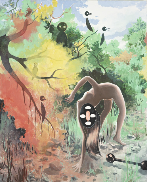
Tilo Baumgartel is a German figurative and narrative painter with a sloping, organic style that I deeply enjoy. Like me he was inspired by comic book artists and old narrative painters like William Hogarth to make artworks that tell a story, in his case, open-ended and apocalyptic fairytales. The atmosphere of his paintings are often strange, quiet, and surreal, often with a foreboding end-of-the-world vibe.

Patron, 2012
Baumgartel's characters often look very at-home in their strange environments; comfortable, undisturbed, and even apathetic to the weird activities and architecture around them. This contributes to the surreal atmosphere embraced by his toxic pastel color palette.

Though the artist believes that the multilayered complexity of dreams can't be replicated in painting (only film), he does strives for its likeness "What I am able to do... is borrow the atmosphere of dreams, but with a completely different plot and characters."

But Baumgartel also aims for drama and "unstable energy" in his work, which is more often captured in odd acrobatic poses with strong silhouettes than in his gentle brushstrokes.

Untitled, 2011
Perhaps the originality of Baumgartel's paintings can be attributed to the stream-of-consciousness process behind their creation.

"I go to the studio, sit down at the table and start drawing. I give myself over to drawing, without any rational thought. And at that moment, perhaps, the material for the next painting is created. Sometimes an idea forms while I'm waiting at a red light, and I try to sketch it out that evening. I think that's what it's like for any artist. If you try to deliberately think up something special, make something interesting – it won't work. The ideas for paintings come about from a string of small chance happenings."

Yoma II, 2014
I feel I can relate to the non-academic construction of Baumgartel's compositions, which seem descriptive and narrative but not rigidly planned. He uses slopes and diagonals in many of his works in order to lead the viewer's eye but he doesn't force a strong focal point in the piece, flattening his spaces so that background elements can be appreciated just as much as his central subjects. The chaotic appearance that would normally result from this is resolved by his monochromatic colors and low-contrast value scale. 
 
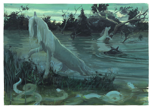
His strongest pieces (in my opinion) are those that captivate you with a stunning subject (the wide-eyed leftmost horse in "Albis") and then surprise you with even more interesting side elements (the snakes and equally terrified expressions of the swimming horses).

Albis
A final quote from Baumgartel that I found inspiring in its encouragement: 

"Every artist should work just for themselves at least in some sort of capacity. The next step is to think about how to set up your life so that you can work without any unnecessary stress and worries about making a living. Perhaps, for some, this means setting aside time for another job on the side. Philip Glass used to drive a taxi, and he composed several of his works while at the wheel. In any case, being a good artist and making lots of money are usually two mutually exclusive things."
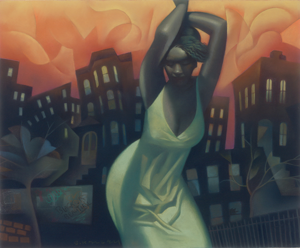
Gary Kelley is an American illustrator who works primarily in pastels. His works draw from the geometric simplification of cubism and the flat calligraphic linework of art nouveau, but his muted palettes are a consistent and gorgeous feature of his art. He's done a lot of editorial and book illustration as well as murals.


Siren

I am really inspired by Kelley's control of pastels. His work has such a wonderful soft glow to it but his silhouettes are insanely clean and sharp. This allows him to really sell the strength of his dynamic gestures. I also love how he tilts the geometry of his shapes to lead the viewer's eye and convey a surreal sense of movement.

Harlem Heat

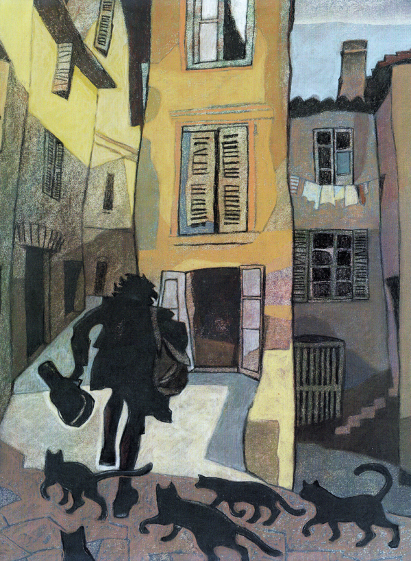
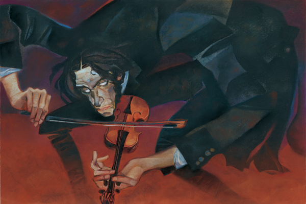
Kelley is also capable of styles that I'd call a little more cartoony. His work for the book "Dark Fiddler" is really emotive, sort of creepy and really fun. I especially admire how he divides his compositions into aesthetically pleasing segments using limbs and architecture, not constrained by concerns for realism. I think he's a great example of how fine art can be effectively used in commercial media.


Illustration from "Dark Fiddler - The Life and Legend of Nikolo Paganini", 2011


Illustration from "Dark Fiddler - The Life and Legend of Nikolo Paganini", 2011


I think it would be awesome to make sculptural work.

I spent much of my childhood not actually playing with toys but posing them. G.I. Joes, plastic cars, Barbies, tissue boxes, anything I could get my hands on would end up displayed in gigantic battles and slice-of-life comedies on my bedroom desk. I'd always leave them posed that way for a couple days since the work to get them upright and undisturbed took hours, but after that I'd disassemble them and making something new. Funnily, I've never stopped thinking of my work in terms of a 3d playset despite working on two-dimensional surfaces; my priority is still to pose the characters in ways that communicate their relationships to each other and also tell a story while showing off a fabricated location.

So for sculptural work, either I could go the toy route and make little fantasy-themed dioramas filled with movable characters, or I could do the same thing in life-size, with viewers able to walk through the setting with its individual sculptures (characters caught up in the overarching narrative of the scene, interacting with each other and their surroundings). The sculptures would be colorful and cartoony, with stylized painted backgrounds and props.

As one example of the type of stuff I'd do, I could fabricate a hole in a gallery wall that would have an enormous eye peeking into a brightly colored living room with plaster painted furniture. Freestanding characters would be recoiling in fear, dropping household items and bolting towards the exit. I'd like viewers to walk through and examine little details of the setup while just appreciating the humor of the narrative and being a part of its space. In a sense, working in 3d would more easily fulfill my goal of engaging viewers in the entertaining aspects of artwork.

Sunday, October 4, 2015

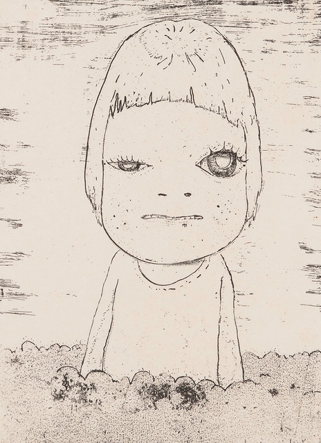
Yoshitomo Nara is a Japanese pop artist who delves into painting, woodcuts, and three-dimensional art. Most of his works feature small female children with deceptively cute features that belie their mature facial expressions or accessories (which include knives and cigarettes). The cute-creepy hybrid of his characters is part of a "kimo kawaii" (literally, "disgusting cute") subset of Japanese culture, different from the more typical "kawaii" ("cute") popularized by icons like Hello Kitty.

Too Young to Die, 2001
Nara grew up a fairly independent child since his working class parents were often away from home, and his art seem to convey his feelings about that situation. The works are fantastical, imaginative, cartoony, and seem to resist the realities of growing up and facing the world.

I Don't Want to Grow Up, 2001
I'm not usually satisfied by artworks that are simple, plain, and flat, because I myself aspire to move beyond that type of work. Having said that, the aesthetic is more or less ingrained in me. Nara's characters have an intriguing presence and I enjoy that their lack of detail brings my gaze to their eyes. And I'm not above admitting that some of them are very cute.

Cosmic Girl (Eyes Open, Eyes Shut), 2008


But the popular opinion of these girls' appeal is really their punk, independent spirit. The children seem confident, wise, experienced, defiant, indignant, emotionally fortified and strong-willed. To me, corrupted is another adjective that comes to mind. With their pop art stylization, the girls can be seen as icons of lost innocence, or perhaps as protectors of innocence who have already lost the battle themselves. Speaking of his works where the children hold weapons, Nara says “I kind of see the children among other, bigger, bad people all around them, who are holding bigger knives..." And with the children often looking up at the viewer, we seem to be implicated as part of the problem.

Some of Nara's works are designed like pages taken from a child's journal, and these cutesy scribbles combined with his more maturely composed portrait subjects seem to document a shift from innocence to maturity. The indirect implication of this shift makes the images all the more unsettling, like a horror-themed puzzle missing the piece that details the face of its monster; we don't know what happened to make these children look at us the way they do.

Haze Day, 2002


Adrian Ghenie is a Romanian painter whose work suggests the aftermath of ideological struggles, war, and dictatorship, with allusions to the history of Romania and Europe in general. He takes heavy inspiration from cinema and art history. 

Adrian Ghenie, The Sunflowers in 1937, 2014:
The Sunflowers in 1937, 2014
 "Film has provided the most important ingredient of my visual background," Ghenie explains. "When I paint I have the impression that I am also involved in directing a film... I think consciously and unconsciously I want to master in painting what David Lynch has done in cinema." Beyond Lynch's surreal dramas, the artist also references 1920s silent comedies in his "Pie Fight" series, which corrupts iconic imagery of comedic food fights with bloody smears and fragmented Nazi imagery. 

Adrian-Ghenie-Pie-Fight-Venice-56e-Biennale-de-Venise-Pace
Pie Fight Study 18/2/12, 2012
World War II is of particular interest to Ghenie. “No discovery is ever good or bad—it depends on how you use it,” he muses on Darwin's theory of natural selection, which inspired Nazi eugenics. He sees the melding of malicious ideologies with bureaucratic objectives as a failure that could happen to any person, but especially to those with a lust for power. We don't see this concept fleshed out in narrative painting formats but rather in emotive still-shots that seem to capture figures at the heights of insanity. I'm fond of the universality of his ideas despite the lack of storytelling.

Pie Fight Interior 8, 2012


Like other artists I've examined on my blog, Ghenie has an impressionist style, and his paintings are very weathered, sculptural, and look like messy palette studies with how paint is haphazardly smeared across them. I enjoy them for their messy patterns, with colorful shapes breaking up the more flat but realistic planes.
Ghenie does appropriate from other artists and his work has often been compared to Francis Bacon's, but I don't feel he reaches the same type of angst that Bacon's work does. Ghenie's work is more colorfully varied and explosive, and leans towards violence more than the quiet, weird, foreboding malice of Bacon's figures. He is also far more cinematic in his compositions, which don't feel idealized and meticulously planned but rather like cropped play-sets. When Ghenie does do subtle, he also paints with much greater realism. I'm a fan of both his styles.

Dada is Dead, 2009