Sunday, October 25, 2015

Nicole Eisenman is an American artist who works in a variety of mediums from sculpture to prints and paintings. She explores a range of political issues in her work but tries to stay current, starting with works about homosexuality and then moving into topics like racial, class and gender inequalities. She makes a point of saying she tired of one-off political jokes in the early 2000s, but satire definitely remains a part of her contemporary pieces.


Coping, 2008
One of the most striking parts of Eisenman's work is the sense of community created by her diverse casts of characters. Imaginative abstractions appear alongside the artist herself and her friends, this living world of individuals and caricatures coming strangely close to a realistic representation how people experience their surroundings; some things are peripheral, others familiar, and still others are fascinatingly weird unknowns.

"There is no set way to deal with a question as broad and deep as identity and I don’t want to limit myself to any one way of painting. Sometimes figures are clearly defined, sometimes it’s ambiguous or the question simply evaporates. I’d like to tap into a universal human experience but know there’s no such thing; we all experience the world differently. When gender and race are eliminated, something else is left to see; other connections are made between the figures and their worlds."

Little Shaver, 2005


To Eisenman, her paintings are only pieces serving a larger community of artists who all contribute their unique views to humanity, views that she herself wishes to express but can't figure out how to paint. 

"The over abundance of disposable and meaningless images gives oil painting more value. It’s shocking to go to a museum now and be reminded of the power a painting can have after surfing the Internet all day... It’s the realization that you’re not just looking at a painting, say, by Van Gogh, but that one can actually commune with his spirit, just by looking, and time collapses."
Commerce Feeds Creativity, 2004
Eisenman's skill as a painter shows in her vivid colors, clean rendering and versatile style. But I find her ideas just as if not more inspiring than her punchy visuals. These are images that you want to decode and investigate for extra narrative details.
Ketchup & Mustard War, 2005
Kaye Donachie is a British figurative painter with a deliberately limited color palette. Her work is usually monochromatic or bichromatic, with highly saturated spots of color that seem to glow off the painting's surface.

How heavy the days, 2006
Donachie renders very sparsely, so there is a quick and light quality to her figures that I find very pretty. She keeps them looking mysterious, with her favored dawn/dusk lighting serving more to show off the beauty of her geometric simplifications than to illuminate any distinguishing details. These human impressions are often idealized with dreamy expressions and contemplative postures, recalling a kind of love-struck hypnotism common to old romance flicks and neoclassical portraiture. 
Dusk shed by a lamp brightens the tears, 2009
Kaye Donachie Maureen Paley 09
Anchored by day, drawn in at night, 2010 
Kaye Donachie Maureen Paley
Clouds are pushing in grey reluctance, 2009
Donachie also does ambitious works that are slightly more naturalistic or that include a multitude of figures. However, I find these paintings a little uninteresting. Without the aesthetic strength of a solitary figure with a pleasing simplification of shape, Donachie's works don't have any apparent content to them, and whatever story is being told has no interesting twist. It's sad to say that throwing in some non sequiturs would put them on par with some of the stuff I've looked at over the semester.


The Epiphany, 2002
Kaye Donachie Maureen Paley 14
Early Morning Hours Of The Night, 2003


Which leads me to think about something: I've noticed throughout this semester how much I love atmosphere-dense imagery, but it's also a little frustrating to see how content plays a secondary role in these. "Ambiguity" sometimes makes me suspicious; are the works ambiguous or unresearched? It's great to see artists painting what they want to paint, but it also feels insubstantial when they don't venture outside their own aesthetics. I do recognize that being an individual with concentrated focus and style is sort of the point of fine art, but it somehow feels unfair to celebrate something that's more or less innate. Dana Schutz stands out to me as someone who tries a lot of concepts and I really like her for it, even when the works aren't as pretty or atmospheric as Donachie's.

Thursday, October 22, 2015

Midterm Self-Evaluation

I've been happiest with my oil painting experiments thus far, since I have improved a little at building up form. The discovery that larger canvases are more suited to my way of painting is also a step in the right direction

The other mediums I've used have been an interesting learning experience but I don't feel very attached to any one of them (even oil paint). I miss digital painting and all its flexibility, speediness and cleanliness, especially since the medium has an inherently commercial vibe (so I don't have to worry about something looking old-fashioned or out-of-touch). But I can't deny that it's good for me to get out of my comfort zone, and that is exactly what I intended to do when I chose my jumping-off point for this semester.

In general I don't feel very satisfied with the quality of my work as advertisements, in part because their craftsmanship isn't high-end but also because I repeatedly find their effectiveness difficult to judge without a "client" to give feedback.  In addition, making random, unconnected ad illustrations every week has a lack of continuity and therefore satisfaction. I can't tell if I am improving on my concepts.

I think I may need to narrow my focus to a couple products and then explore multiple advertising methods for each, possibly as smaller studies, before picking a few of the best and seeing them through. This way I can achieve a greater depth of thinking about how to communicate and not worry about trying something new every time. It will also allow me to focus on getting better at my chosen medium before I delve into anything grand. It'll be interesting to see whether this will resolve the problems I've been having. 

Sunday, October 18, 2015

What artwork would you want to do if you had no fears of failure, no worries about cost? What’s the best artwork you can imagine doing? Describe it.

Similar to my previous blog post about what my artwork would look like as sculpture, I'd buy up a large geographical area and make a city of different fantasy scenarios, as if I were making an assembly of set designs for a theme park. People would be able to walk through the sets as if they were touring a variety of different universes, basically like Disneyland but without the rides. 

I think the ultimate result would be as unsettling as it would be fascinating, as a visual, interactive expression of escapism that simultaneously doesn't offer much comfort or diversion beyond being something to look at. I'd like people to get lost as they travel through the area rather than be guided on where to go and look, and there'd be neither sound nor signage to contribute to a more cheesy theme park atmosphere (just some security personnel to help you find an exit). The displays would vary between being inside buildings or outdoors, and even with proper lighting they would become quite creepy at night. There'd be a lot of small details to uncover and fill out the narratives of the art provided visitors look in less obvious places (behind foliage and curtains, through tunnels and up stairwells). For me this is just the kind of place I'd love to explore. 

This kind of art would still allow me to make fun cartoony stories and experiment with different topics for my own sake (as I would constantly add new scenarios to my park) while also offering an entirely different and weird immersive experience to visitors. 

A problem with 2d art, as much as I like it, is that it makes singular, isolated impression, and by nature of this impression being manufactured by the artist, it can also be resented or taken for granted. But a massive, interactive 3d artwork like this would not be a controlled end-product. So I think it could invite a sense of childlike wonder and interest in exploring the new territories I've created, creating some actual lasting memories for people. I love to do something as big and crazy as this!

Sunday, October 11, 2015

Tilo Baumgartel is a German figurative and narrative painter with a sloping, organic style that I deeply enjoy. Like me he was inspired by comic book artists and old narrative painters like William Hogarth to make artworks that tell a story, in his case, open-ended and apocalyptic fairytales. The atmosphere of his paintings are often strange, quiet, and surreal, often with a foreboding end-of-the-world vibe.

Patron, 2012
Baumgartel's characters often look very at-home in their strange environments; comfortable, undisturbed, and even apathetic to the weird activities and architecture around them. This contributes to the surreal atmosphere embraced by his toxic pastel color palette.

Though the artist believes that the multilayered complexity of dreams can't be replicated in painting (only film), he does strives for its likeness "What I am able to do... is borrow the atmosphere of dreams, but with a completely different plot and characters."

But Baumgartel also aims for drama and "unstable energy" in his work, which is more often captured in odd acrobatic poses with strong silhouettes than in his gentle brushstrokes.

Untitled, 2011
Perhaps the originality of Baumgartel's paintings can be attributed to the stream-of-consciousness process behind their creation.

"I go to the studio, sit down at the table and start drawing. I give myself over to drawing, without any rational thought. And at that moment, perhaps, the material for the next painting is created. Sometimes an idea forms while I'm waiting at a red light, and I try to sketch it out that evening. I think that's what it's like for any artist. If you try to deliberately think up something special, make something interesting – it won't work. The ideas for paintings come about from a string of small chance happenings."
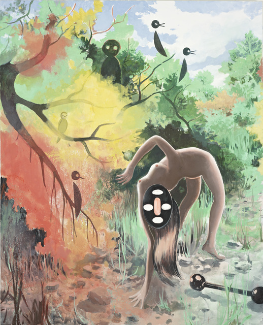
Yoma II, 2014
I feel I can relate to the non-academic construction of Baumgartel's compositions, which seem descriptive and narrative but not rigidly planned. He uses slopes and diagonals in many of his works in order to lead the viewer's eye but he doesn't force a strong focal point in the piece, flattening his spaces so that background elements can be appreciated just as much as his central subjects. The chaotic appearance that would normally result from this is resolved by his monochromatic colors and low-contrast value scale. 
 
His strongest pieces (in my opinion) are those that captivate you with a stunning subject (the wide-eyed leftmost horse in "Albis") and then surprise you with even more interesting side elements (the snakes and equally terrified expressions of the swimming horses).
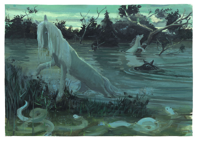
Albis
A final quote from Baumgartel that I found inspiring in its encouragement: 

"Every artist should work just for themselves at least in some sort of capacity. The next step is to think about how to set up your life so that you can work without any unnecessary stress and worries about making a living. Perhaps, for some, this means setting aside time for another job on the side. Philip Glass used to drive a taxi, and he composed several of his works while at the wheel. In any case, being a good artist and making lots of money are usually two mutually exclusive things."
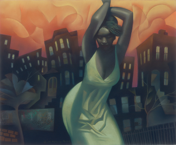
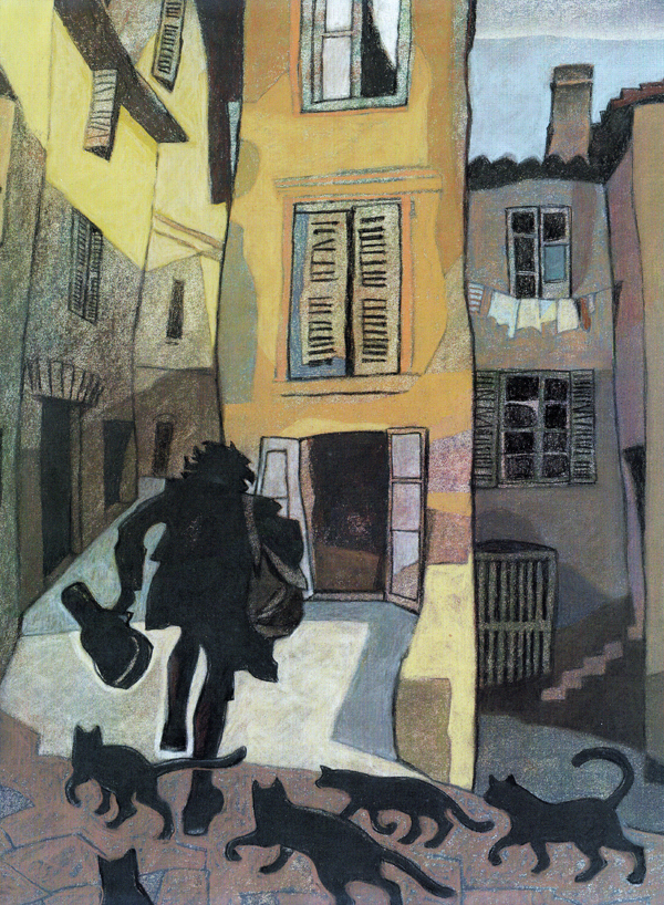
Gary Kelley is an American illustrator who works primarily in pastels. His works draw from the geometric simplification of cubism and the flat calligraphic linework of art nouveau, but his muted palettes are a consistent and gorgeous feature of his art. He's done a lot of editorial and book illustration as well as murals.


Siren

I am really inspired by Kelley's control of pastels. His work has such a wonderful soft glow to it but his silhouettes are insanely clean and sharp. This allows him to really sell the strength of his dynamic gestures. I also love how he tilts the geometry of his shapes to lead the viewer's eye and convey a surreal sense of movement.

Harlem Heat

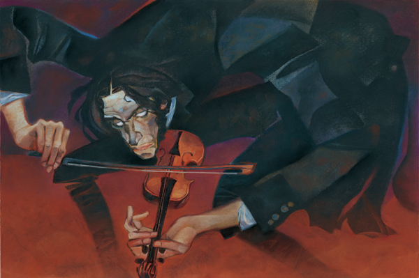
Kelley is also capable of styles that I'd call a little more cartoony. His work for the book "Dark Fiddler" is really emotive, sort of creepy and really fun. I especially admire how he divides his compositions into aesthetically pleasing segments using limbs and architecture, not constrained by concerns for realism. I think he's a great example of how fine art can be effectively used in commercial media.


Illustration from "Dark Fiddler - The Life and Legend of Nikolo Paganini", 2011


Illustration from "Dark Fiddler - The Life and Legend of Nikolo Paganini", 2011


I think it would be awesome to make sculptural work.

I spent much of my childhood not actually playing with toys but posing them. G.I. Joes, plastic cars, Barbies, tissue boxes, anything I could get my hands on would end up displayed in gigantic battles and slice-of-life comedies on my bedroom desk. I'd always leave them posed that way for a couple days since the work to get them upright and undisturbed took hours, but after that I'd disassemble them and making something new. Funnily, I've never stopped thinking of my work in terms of a 3d playset despite working on two-dimensional surfaces; my priority is still to pose the characters in ways that communicate their relationships to each other and also tell a story while showing off a fabricated location.

So for sculptural work, either I could go the toy route and make little fantasy-themed dioramas filled with movable characters, or I could do the same thing in life-size, with viewers able to walk through the setting with its individual sculptures (characters caught up in the overarching narrative of the scene, interacting with each other and their surroundings). The sculptures would be colorful and cartoony, with stylized painted backgrounds and props.

As one example of the type of stuff I'd do, I could fabricate a hole in a gallery wall that would have an enormous eye peeking into a brightly colored living room with plaster painted furniture. Freestanding characters would be recoiling in fear, dropping household items and bolting towards the exit. I'd like viewers to walk through and examine little details of the setup while just appreciating the humor of the narrative and being a part of its space. In a sense, working in 3d would more easily fulfill my goal of engaging viewers in the entertaining aspects of artwork.

Sunday, October 4, 2015

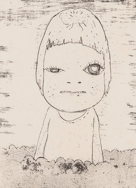
Yoshitomo Nara is a Japanese pop artist who delves into painting, woodcuts, and three-dimensional art. Most of his works feature small female children with deceptively cute features that belie their mature facial expressions or accessories (which include knives and cigarettes). The cute-creepy hybrid of his characters is part of a "kimo kawaii" (literally, "disgusting cute") subset of Japanese culture, different from the more typical "kawaii" ("cute") popularized by icons like Hello Kitty.

Too Young to Die, 2001
Nara grew up a fairly independent child since his working class parents were often away from home, and his art seem to convey his feelings about that situation. The works are fantastical, imaginative, cartoony, and seem to resist the realities of growing up and facing the world.

I Don't Want to Grow Up, 2001
I'm not usually satisfied by artworks that are simple, plain, and flat, because I myself aspire to move beyond that type of work. Having said that, the aesthetic is more or less ingrained in me. Nara's characters have an intriguing presence and I enjoy that their lack of detail brings my gaze to their eyes. And I'm not above admitting that some of them are very cute.

Cosmic Girl (Eyes Open, Eyes Shut), 2008


But the popular opinion of these girls' appeal is really their punk, independent spirit. The children seem confident, wise, experienced, defiant, indignant, emotionally fortified and strong-willed. To me, corrupted is another adjective that comes to mind. With their pop art stylization, the girls can be seen as icons of lost innocence, or perhaps as protectors of innocence who have already lost the battle themselves. Speaking of his works where the children hold weapons, Nara says “I kind of see the children among other, bigger, bad people all around them, who are holding bigger knives..." And with the children often looking up at the viewer, we seem to be implicated as part of the problem.

Some of Nara's works are designed like pages taken from a child's journal, and these cutesy scribbles combined with his more maturely composed portrait subjects seem to document a shift from innocence to maturity. The indirect implication of this shift makes the images all the more unsettling, like a horror-themed puzzle missing the piece that details the face of its monster; we don't know what happened to make these children look at us the way they do.

Haze Day, 2002


Adrian Ghenie is a Romanian painter whose work suggests the aftermath of ideological struggles, war, and dictatorship, with allusions to the history of Romania and Europe in general. He takes heavy inspiration from cinema and art history. 

Adrian Ghenie, The Sunflowers in 1937, 2014:
The Sunflowers in 1937, 2014
 "Film has provided the most important ingredient of my visual background," Ghenie explains. "When I paint I have the impression that I am also involved in directing a film... I think consciously and unconsciously I want to master in painting what David Lynch has done in cinema." Beyond Lynch's surreal dramas, the artist also references 1920s silent comedies in his "Pie Fight" series, which corrupts iconic imagery of comedic food fights with bloody smears and fragmented Nazi imagery. 

Adrian-Ghenie-Pie-Fight-Venice-56e-Biennale-de-Venise-Pace
Pie Fight Study 18/2/12, 2012
World War II is of particular interest to Ghenie. “No discovery is ever good or bad—it depends on how you use it,” he muses on Darwin's theory of natural selection, which inspired Nazi eugenics. He sees the melding of malicious ideologies with bureaucratic objectives as a failure that could happen to any person, but especially to those with a lust for power. We don't see this concept fleshed out in narrative painting formats but rather in emotive still-shots that seem to capture figures at the heights of insanity. I'm fond of the universality of his ideas despite the lack of storytelling.

Pie Fight Interior 8, 2012


Like other artists I've examined on my blog, Ghenie has an impressionist style, and his paintings are very weathered, sculptural, and look like messy palette studies with how paint is haphazardly smeared across them. I enjoy them for their messy patterns, with colorful shapes breaking up the more flat but realistic planes.
Ghenie does appropriate from other artists and his work has often been compared to Francis Bacon's, but I don't feel he reaches the same type of angst that Bacon's work does. Ghenie's work is more colorfully varied and explosive, and leans towards violence more than the quiet, weird, foreboding malice of Bacon's figures. He is also far more cinematic in his compositions, which don't feel idealized and meticulously planned but rather like cropped play-sets. When Ghenie does do subtle, he also paints with much greater realism. I'm a fan of both his styles.

Dada is Dead, 2009
“I wanted to create something that people could relate to without having read a book about it beforehand.”
-CINDY SHERMAN

For most people, art is something they will appreciate aesthetically before moving on to do something else. It's a brief part of their day; few are willing to dig up context or listen to explanations unless they can already relate to the picture. This is why the objective of an illustrator, who translates messages into visuals for public consumption, is to make an "efficient" artwork; something clear, concise, and understandable that its target audience will recognize, and then translate into some kind of take-away message. Any time I make a piece, I approach it from an audience's mindset; does the picture communicate visually, or would I have to explain it? If words are necessary, I haven't done my job right. As important as it is for artists to challenge their viewers intellectually, there is a limit to how hard people will look for a meaning. And if they give up before they find it, the art provides no service to its viewers.